College sports are built upon tradition. Every school has its fight songs, school colors, and mascots many of which go back for generations. This includes of course uniforms and logos which are synonymous with the university or college they represent. Many of these logos – the Texas Longhorn or USC Trojan – are instantly recognizable by sports fans everywhere. Schools, and especially fans, wouldn’t even think of changing them.
Spartan fans may remember when Nike attempted to rebrand Michigan State back in 2009. MSU has switched to Nike before the 2001 football season and both the football and basketball jerseys would undergo a steady stream of changes over the next decade. But the change proposed by Nike in 2009 was not a tweak to the uniforms but a dramatic change to the iconic Spartan Head logo. The proposal set off a flurry of complaints from fans that caused then athletic director Mark Hollis to reconsider and keep the established logo.
So where does this logo stand in the history of MSU logos? What logos are the best, and worst, during the history of Michigan State athletics?
The Worst
While fans certainly did not appreciate the attempt to change their beloved Spartan head, the 2009 proposal was not to worst to actually appear on a team uniform, game program, or t-shirt. To be fair, beauty is in the eye of the beholder and none of the Spartan logos are truly hideous. But some are pretty bad.
Case in point are the 1973 and 1974 helmet logos. The logo was similar to the original Spartan head but reimagined by team member, and art major, Mike Hurd. The design is pretty plain jane and certainly not an improvement over the previous logos. One wonders why the desire to change the logo, much like what happened in 2009.
The MAC logo is a throwback to when the university was known as Michigan Agricultural College (1909-1925). While the football team may have had some success in those days, and even some ties to the vaunted Notre Dame teams of Knute Rockne, the logo itself is nothing special. It is old-school and certainly looks like something from the 1920s but nothing to write home about. Fans who are not history majors must wonder just what this logo means and why their basketball team is wearing it.
The last of the worst is another rebranding effort by Nike.
A reimaging of the “Scripty State” logo, this was a modern attempt to recapture the “magic” of the 1979 championship basketball season. Adopted first by the basketball team and later by the football team, it never caught on like the original. The football uniform of 2002 was particularly bad and was ditched after a single season. It did not help that the team that wore it was no very good on the field. The logo held on for several years on the front of the basketball uniforms. It lives on and can been seen occasionally on Spartan apparel.
The Mediocre
The Block S is perhaps the most well known and most enduring of the Michigan State logos. It is everywhere on everything. After being introduced in 1934 it was brought back by Coach Perles on the football helmet in 1983 and has made various appearances on jerseys and helmets throughout the years in every Spartan sports team. The chief complaint about the logo is that it isn’t unique – it looks exactly the same as the Syracuse and Standford logos – and half the teams in the country are state universities that could rightfully claim it as their own. Let it be said that this logo has a history and is in its own way iconic. It certainly is better that the Diamond Block S version (another failed update to an iconic logo that existed only during Nick Saban’s tenure as football coach).
Next of our logos to elicit a “meh” among fans is the Michigan State Arch Logo worn by the men’s basketball team from 1995 to 2000. Unfortunately, this is the logo that adorned the the 2000 National Championship team and lives on as a pleasant memory for that reason alone. It really is pretty ugly and probably would be among the worst of the MSU logos if not for the connection to the only NCAA title won under Coach Izzo.

Many Spartan fans love the Scripty State logo. It brings forth the same nostalgia as the Arch Logo but with the added mystic sheen of the Magic Johnson era and the legendary 1979 National Championship team. Had that team not been champions this logo too would have likely disappeared into a distant memory. There is certainly nothing wrong with it but it suffers from the same issues as the Block S and is probably unrecognizable to many non-Spartan fans.
The 2009 Nike logo mentioned above gets an honorable mention here in the mediocre column. Some even thought the logo was a smart move from a branding standpoint. Despite the uproar, I am sure that fans would have continued to buy merchandise had the new logo been adopted. Coach Izzo even defended the logo when it was announced and said he was “excited about it.” It still looks much like the 1977 version with a bit more modern feel. But fans don’t usually go for modern over historic. That’s the reason that the original logos almost always win out over their re-imagined counterparts.
The Best
So what logos top the list of the best Spartan logos of all time?
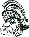
There does not seem to be a definitive date when Gruff Sparty become an MSU logo, as if he always existed in one way or another. His likeness appeared as far back as the 1950s in football programs and is also linked to San Jose State as well. He was used by the basketball team during the late 1970s and has adorned t-shirts, coffee mugs, and all sorts of memorabilia along the way. It wasn’t until the end of the 2020 season that Gruff finally made an appearance on the side of a football helmet in the Penn State game. The logo encapsulates the old-school toughness that Spartan fans love. It is a logo that looks like a cartoon from Warner Brothers and not unlike Bugs Bunny himself continues to stand the test of time.
The original 1965-66 Spartan Head logo has three important things going for it. First, it’s the original. Every Spartan Head that follows is an imitation or reimagining of this version. Second, it’s clear that this logo stands for the Spartans and not just any team with State in its title. This logo is a mascot and not just a plain old letter like the traditional Block S. Third, when the Spartans wore this logo in 1965 and 1966 the football team was really, really good. It has the ability to produce same kind of nostalgia for fans evoked by the Scripty State or Arch State logos but is actually a good-looking logo all on its own. Its chief drawback is that most fans do not remember that the Spartans were actually National Champions in the 1960s.
Which brings us to the best Michigan State logo of them all.
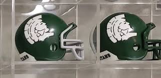
The Spartan Head logo debuted on a Michigan State football helmet for the first time in 1977. Unlike other rebranding efforts mentioned above this made the old, cartoon-style drawing into a modern sports icon. Ironically, though Nike tried to ditch the logo for an updated one in 2009, it was ranked by Jim Weber of Athlon Sports as the best logo in FBS sports in 2016. Weber stated in his review:
“This Spartan helmet silhouette ranks supreme here because it’s everything you want in a logo: Striking but understated, strong but subtle and just all-around awesome. And after years of endlessly toying with the shade of green, Michigan State finally hit the jackpot.”
Jim Weber, Athlon Sports
Four years later the logo was also voted the best in the Big Ten.
It probably does not hurt that the Spartans have had a winning basketball program since Izzo took over the program in the 90s, and a decade of football success as well under Mark Dantonio. Everyone likes a winner.